Client: Tatte Bakery & Café, a local business
Timeline: 80+ hours
Deliverable(s): Website prototype, Re-branding
Team: Self-directed, with feedback from mentor and peers
Role: UX/UI Designer
Tools: Adobe XD & Illustrator
THE CHALLENGE.
With 12 locations in various Boston neighborhoods, Tatte Bakery & Café is a notoriously packed all-day brunch service spot. Their menu features multiple Israeli-inspired dishes such as shakshuka, tartines, and breakfast sandwiches. Their minimalist and welcoming decor is familiar to the local audience since opening in 2007. To offer more accessibility to its customers, Tatte seeks to further develop their online platform for a more seamless ordering process.
This is a speculative project, and I am not affiliated with Tatte Bakery & Café.
OBJECTIVES.
• To design a responsive website for Tatte Bakery & Café guests
• To re-design Tatte's logo and branding that is consistent with its established brand
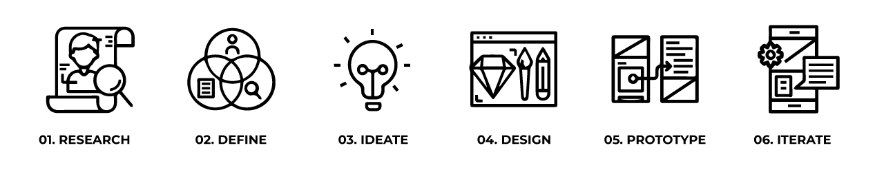
PROCESS.
________
01. RESEARCH
Goal: To research the current position of the business and its guests
Process: Market Research / Competitive Analysis / Contextual Inquiry Interviews / Site Audit
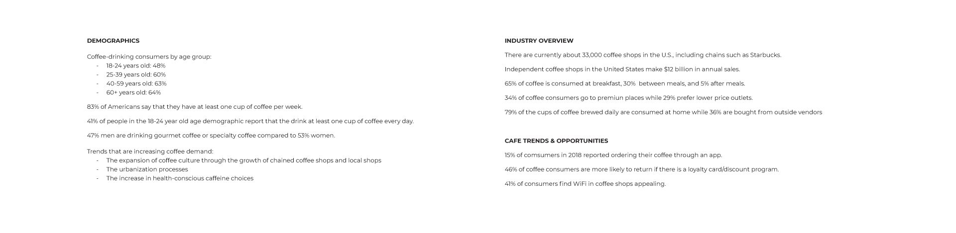
MARKET RESEARCH.
Since 2007, Tatte has grown due to its quality baked goods and aesthetics. Additionally, the business prioritizes the overall dining experience. From visuals to the bold flavors, it truly strives to serve unique and accessible experiences for everyone. Tatte's popularity is largely due to memorable experiences captured in the moment along with good company. Redesigning a website presents an opportunity to further expand upon the business' accessibility online by providing the convenience of mobile ordering with location-specific information. Research has shown that cafes have become highly-saturated. This means an online presence catered towards users is critical for helping them discover Tatte.
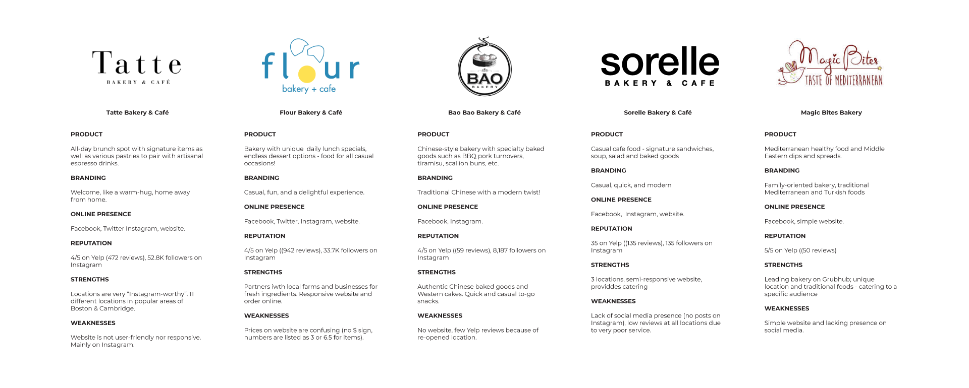
COMPETITIVE ANALYSIS.
I've identified other bakeries and cafes that target similar audience as Tatte and analyzed their online presence. This comparison allowed me to better understand expectations and how Tatte can position itself against competing businesses. Overall, Tatte seems to have a very well-established social media presence among locals and tourists. However, a stronger online presence could further provide a larger audience with Tatte's unique experience.
CONTEXTUAL INQUIRY INTERVIEWS.
To learn more about the customer experience at Tatte, I conducted contextual inquiry interviews with 6 Tatte guests about their experiences. I visited Tatte on two seperate days (Friday and Saturday) between popular business hours 9:00 AM to 12:00 PM and 3:00 PM to 6:30 PM at 3 different locations (Harvard Square, Back Bay, and Downtown Crossing). During my visits, I also made a purchase and stayed to do some work to collect data about my personal experiences and the environment that they offered. By the end, I learned more about the audience Tatte serves and how the business interacts with their guests.
• Number of Participants: 6
• Gender: 3 male / 3 female
• Age: 18-30 years old
• All but 1 were from the Boston or Cambridge area
• 1 was visiting for the first time / 5 had been a Tatte location before
• 1 was visiting for the first time / 5 had been a Tatte location before
SITE AUDIT.
To quickly identify strengths and weaknesses with the current site, I conducted a site audit. I evaluated the usability based on Jakob Neilsom's Heuristics as well as some elements/principles of design (such as visual hierarchy).

________
02. DEFINE
Goal: To define the target user and understand their needs, goals, and frustrations
Process: Empathy Map / Persona / POV Statements & HMW Questions
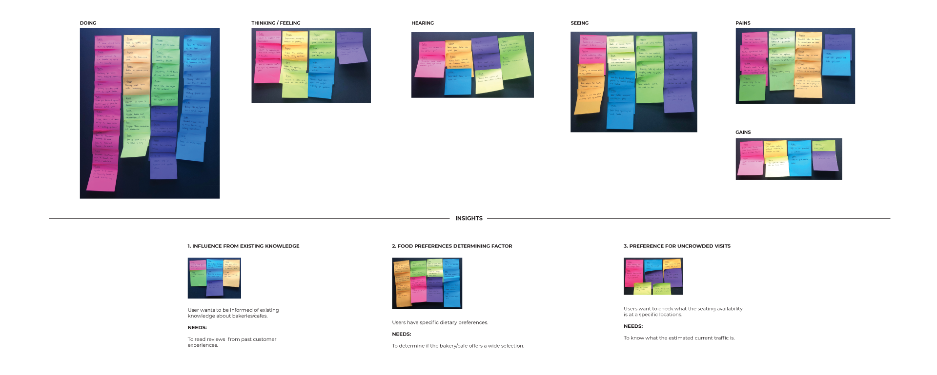
EMPATHY MAP.
After talking to Tatte guests, I constructed an empathy map by organizing the data points from each interview participant into groups. I was able to identify the user needs based off of the most frequent patterns within the user data.
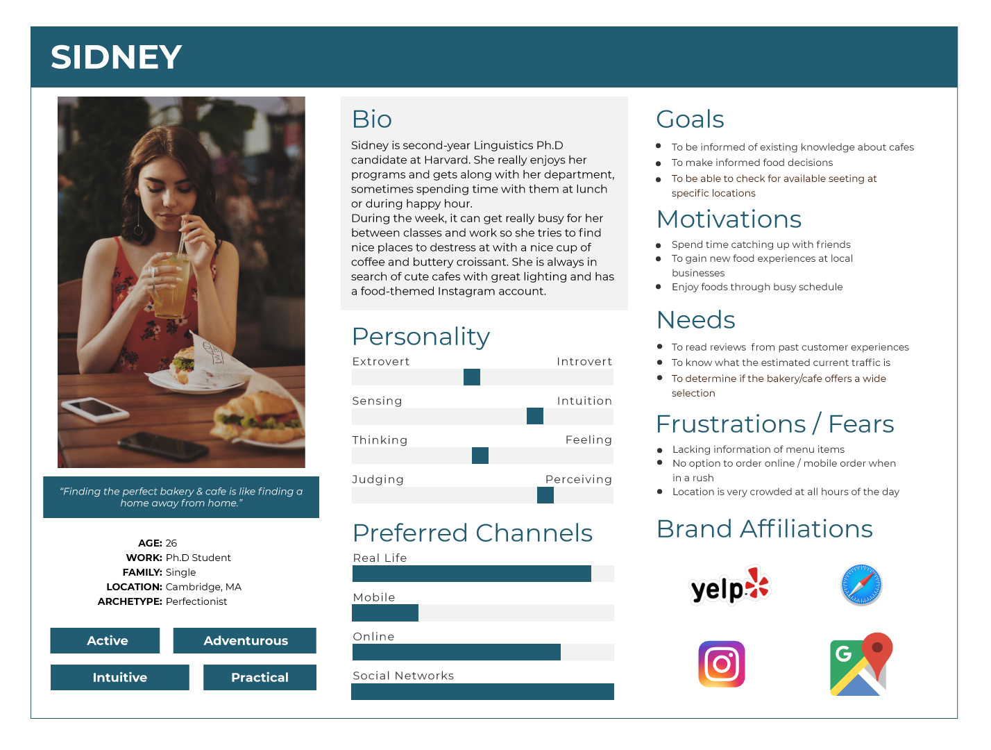
PERSONA.
Next, I created a person "Sidney" to represent the findings synthesized from the empathy map. Sidney is Tatte's target guest, somebody who wants to have pleasurable and informed experiences enjoying food whether it be with good company or solo. By giving context and personality to the research data, we can better empathize with the target customers throughout the design process.
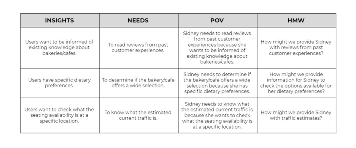
POV STATEMENTS & HMW QUESTIONS.
After defining the target user, I created point-of-view statements to frame the insights and user needs. From these statements, I created how-might-we questions that encourage ideating solutions for Sidney's needs.
________
03. IDEATE
Goal: To ideate website features, information architecture, and flows
Process: Product Roadmap / Sitemap / Task Flow / User Flow
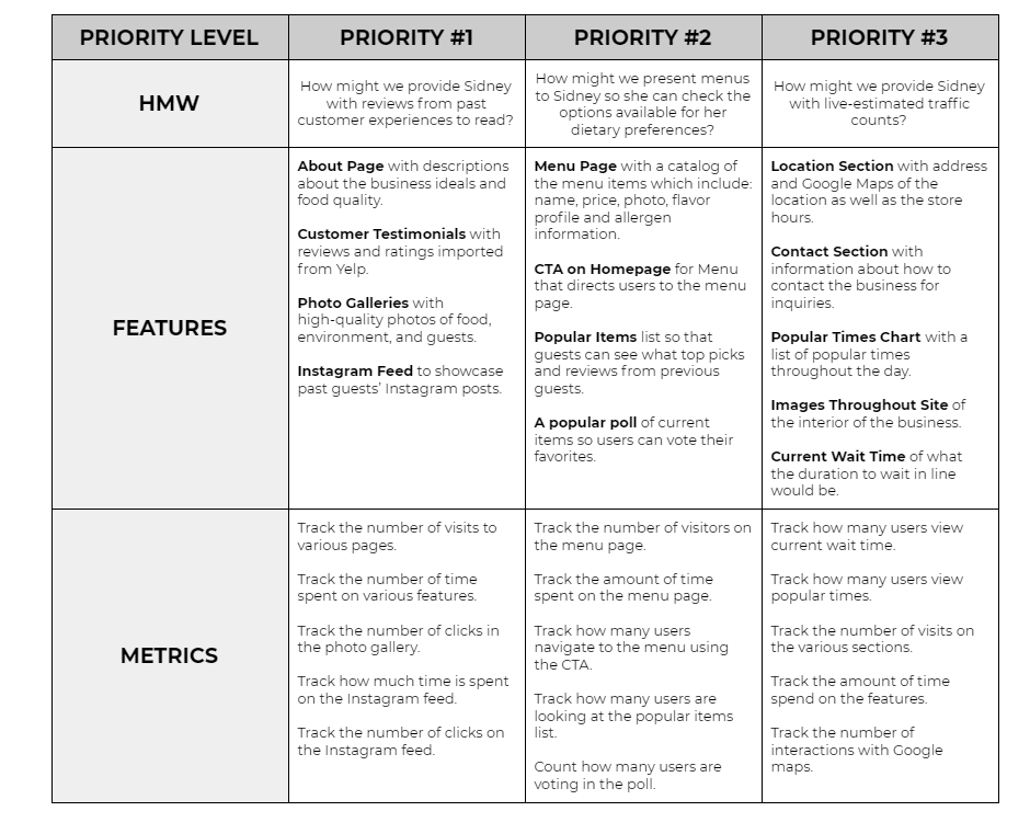
PRODUCT ROADMAP.
Starting from the HMW questions, I brainstormed as many solutions as I could think of (within 10 minutes each) and chose several features to prioritize within the website design. I chose features based on feasibility, how many people the feature would impact, and how much impact the feature had on each person. The roadmap focused on several key features to solve Sidney's needs. without becoming overwhelmed by all the possible features to implement.
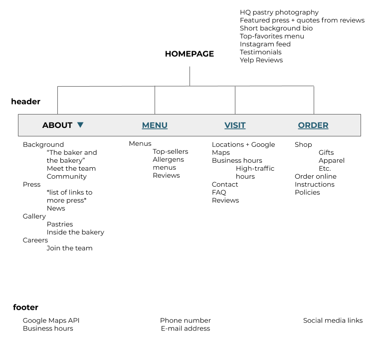
SITEMAP.
Then, I created a sitemap in order to visualize how the information can be structured as if a user was intuitively navigating throughout the website. After researching other restaurant websites, I decided that basic layout consisting of several pages would be the most intuitive for users to navigate. This would satisfy the user needs we identified.
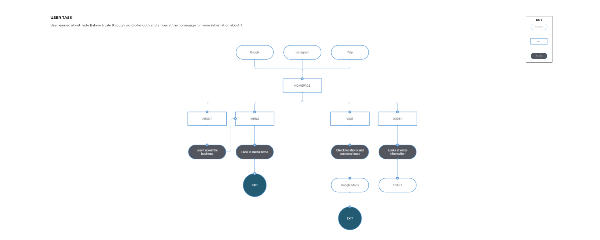
USER FLOW.
To analyze the flow throughout the website, I mapped out a user flow scenario that was common among my research phase. Examining the sequence of user actions for the scenario showed the relationships between screens, which gave me a better understanding about how to craft intuitive experiences throughout the UI.
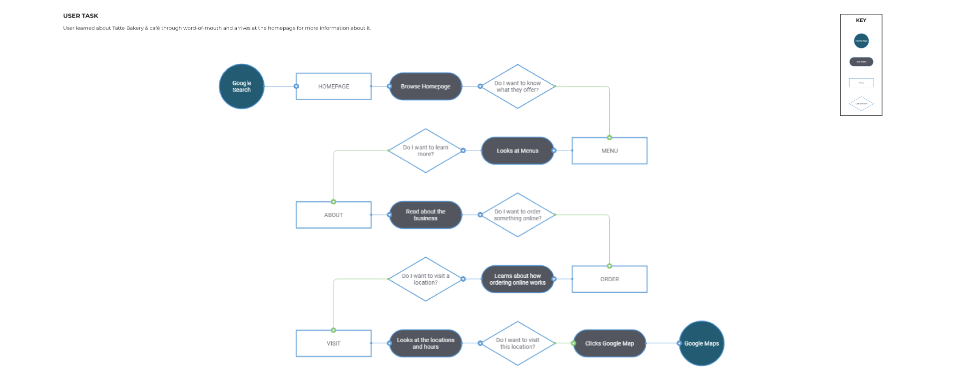
TASK FLOW.
I explored the flow in more detail by constructing a task flow about a user who wants to learn more about Tatte. The task flow helped me think through the user's process in more detail and prioritize certain pieces of information.
________
04. DESIGN
Goal: To design mid-fidelity wireframes for responsive screens
Process: Sketches / Mid-Fidelity Wireframes
SKETCHES.
I began my UI designing process by creating rough sketches of the pages I wanted to include. With cleaner and annotated versions of the sketches, I was able to present my ideas to others and gain constructive feedback at an early stage of the design. During this process, I referred to examples from various cafes and studied existing design patterns that make for a more intuitive user experience.

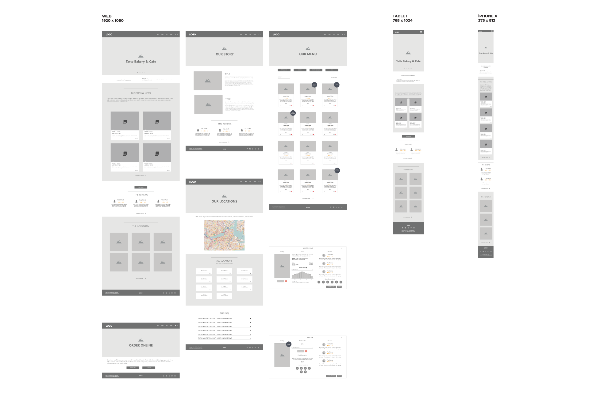
MID-FIDELITY WIREFRAMES.
With my sketches as a reference, I then moved into Adobe XD to create mid-fidelity wireframes for desktop, tablet, and mobile versions of each page. This guided me to focus on the basic layout and visual hierarchy of the website across various screens.
________
05. PROTOTYPE
Goal: To prototype a mid-fidelity website and again usability feedback
Process: Mid-Fidelity Prototype / Usability Testing
MID-FIDELITY PROTOTYPE.
Before creating high-fidelity wireframes, I performed a usability testing with the current designs as a mid-fidelity prototype. This way, the test focused on usability and was not distracted or biased by visuals. I used Adobe XD to create the prototype in preparation for the usability testing. Feel free to interact with the prototype by using the button below!
USABILITY TESTING.
Objectives:
• To observe initial impress of website - is it aesthetically pleasing?
• To test the overall quality and ease of use while navigating the design - does it flow?
• To observe how users interact with design to complete task - is it confusing?
• To test the search process for pain points - what is a barrier to a good experience?
• To note unmet needs to implement in future iterations - what can be done better?
Tasks, Errands:
Scenario 1
Your best friends are visiting you this weekend and you want to take them to a neat Boston-local brunch spot. You remember that someone told you about Tatte’s amazing all-day brunch menu. But before settling on this being the spot, you remember that one of your friends is vegan. You go online to check out their online menus to make sure that there will be vegan options.
• Task: From the homepage, navigate to the menus
• Task: View the menu items and see if there are any vegan options
Scenario 2
It’s the day of brunch and you and your friends are about to head to the cafe but you all want to avoid the crowds. After a quick Google search, you pull up the website again and double-check the logistics.
• Task: Find the address and store hours of the nearest location
• Task: Decide what time you and your friends will visit to avoid the crowds
Results:
I conducted usability testing at local cafes with 6 participants who have a similar background to our persona, Sidney. From direct observation and audio recordings, I was able to collect valuable usability feedback from target users.
I conducted usability testing at local cafes with 6 participants who have a similar background to our persona, Sidney. From direct observation and audio recordings, I was able to collect valuable usability feedback from target users.
________
06. ITERATE
Goal: To iterate upon the design and develop high-fidelity wireframes
Process: Affinity Map / Revised Wireframes & Prototype / Branding / High-Fidelity Wireframes & Prototype / UI Kit
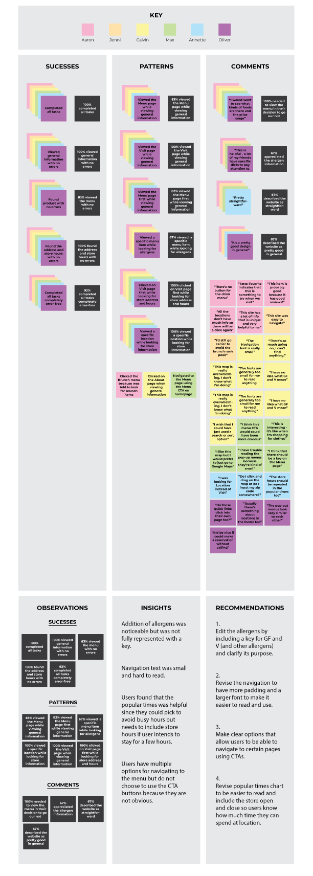
AFFINITY MAP.
I created an affinity map to synthesize the usability findings and to identify reoccurring behaviors and feedback. This allowed me to better understand the usability of the current design. The synthesized data indicated that minors adjustments would provide for more legibility in the overall design.
REVISED WIREFRAMES & PROTOTYPE.
With the information I gathered in the affinity map, I revised the wireframes and prototype. Feel free to interact with the revised prototype using the button below!
BRANDING.
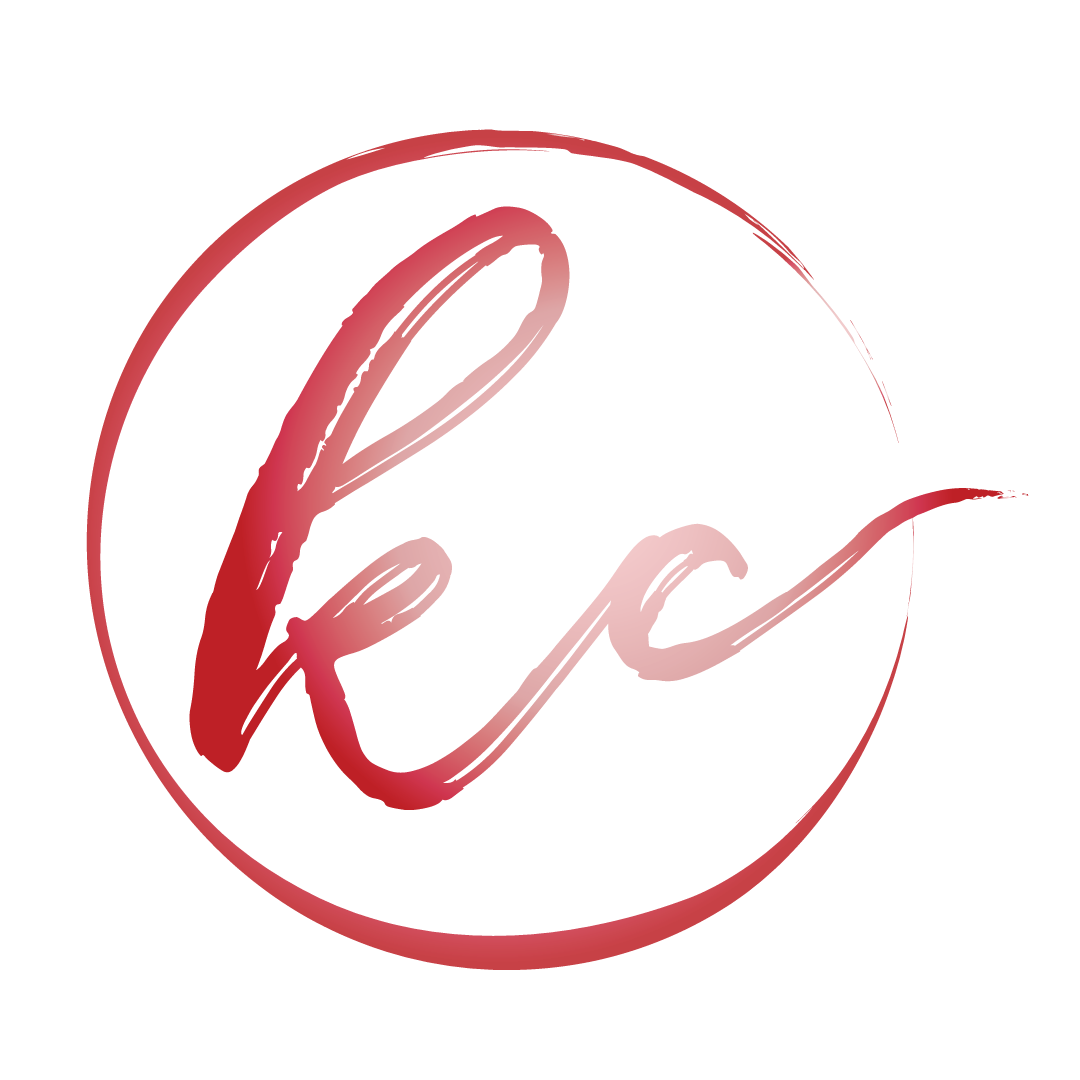
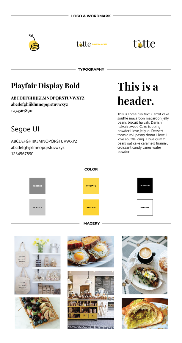
Before moving into high-fidelity wireframes, I created branding guidelines to make sure the branding is cohesive and agrees with Tatte's existing branding efforts. After gathering inspiration in a mood board, I decided to revamp Tatte's logo with the addition of a bright happy color and establishment of a cherry to represent their fruit tarts.
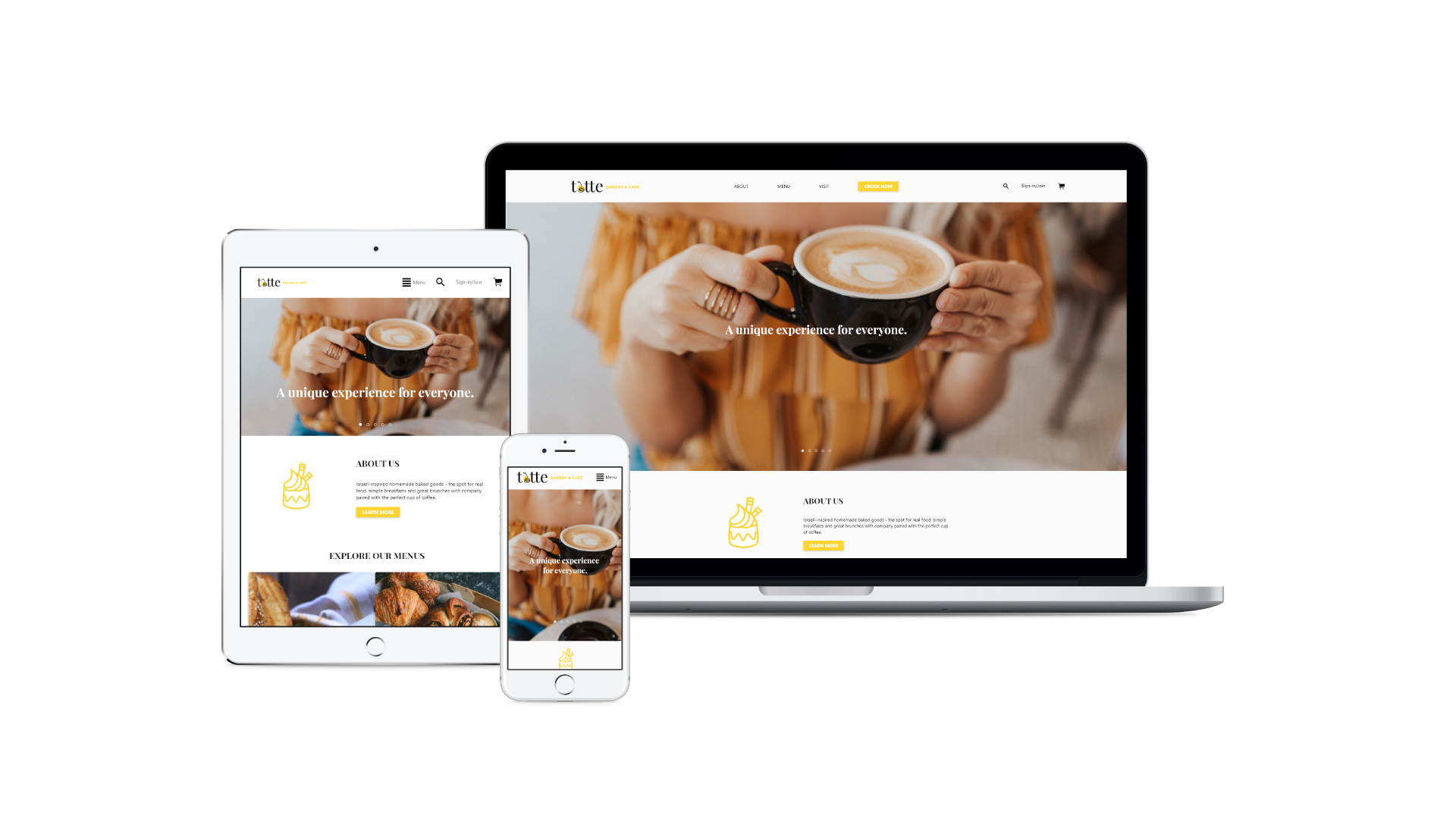
HIGH-FIDELITY WIREFRAMES & PROTOTYPE.
Finally, I applied the branding and styling to the wireframes in Adobe XD and made an updated prototype. The deliverable showcases the polished look and feed of the website, which helps convey the design to people such as stakeholders. Feel free to view the desktop prototype in the link below!
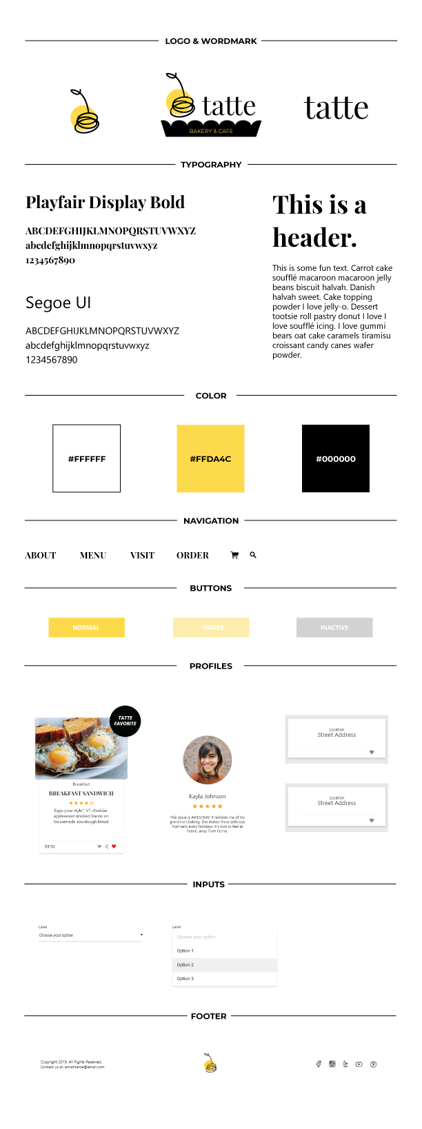
UI KIT.
While prototyping, I completed a UI kit to document UI elements and patterns for future reference.
REFLECTION.
Overall, this project was relatively straightforward because the website was primarily a readjustment of information flow and targeted a broad audience. The main takeaway from this project was the development of a responsive web design. Not only did I have to use research to develop my design, I also had to ensure that it was legible and accessible to the users. Moving forward, I'd want to share my designs with developers and see how we could implement the new design and update the current design.
NEXT STEPS.
• Work with developers to launch the website
• Gain usability feedback
• continue organizing design deliverable(s) for hand-off
• Work with developers to launch the website
• Gain usability feedback
• continue organizing design deliverable(s) for hand-off