Client: Foodfull
Timeline: 80+ hours
Deliverable: iPhone app prototype
Team: Self-directed, with feedback from mentor and peers
Role: UX/UI Designer
Tools: Adobe XD & Illustrator
THE CHALLENGE.
As of 2018, data shows that Americans waste about a pound of food per person each day. In fact, people who had healthier diets rich in fruits and vegetables were the most wasteful. Foodfull wants to give a user-centric approach to their app, adding features and flows that encourage users to be more conscious of their carbon footprint.
This is a speculative project.
OBJECTIVES.
• To design a mobile application
• To design Foodfull's brand
PROCESS.
________
01. RESEARCH
Goal: To research the business, product, and users
Process: Market Research / Competitive Analysis / Interviews
MARKET RESEARCH.
I started off with market research to gain a general understanding of the problem at hand - food waste. As of 2018, data shows that Americans waste about a pound of food per person each day, with people who have healthier diets rich in fruits and vegetables being the most wasteful.
COMPETITIVE ANALYSIS.
Next, I did a competitive analysis to compare various mobile solutions that current exist to minimize food waste and organize a user's fridge. This allowed me to observe shared features offered by the different apps.
INTERVIEWS.
To learn more about users, I conducted interviews at a local cafe with 5 individuals about their experiences with grocery shopping and food storage.
• Number of Participants: 5
• Gender: 2 male / 3 female
• Age: 21-25 years old
________
02. DEFINE
Goal: To define the target user and understand their needs, goals, and frustrations
Process: Empathy Map / Persona / POV Statements & HMW Questions
EMPATHY MAP.
With the notes from my interviews, I synthesized my research findings by creating an empathy map. I looked for patterns based on the stories and experiences shared from the conversations I had. It was clear that none of the users currently use any method to organize their shopping or groceries at home aside from making a mental note.
PERSONA.
Next, I created a person "Cameron" to represent the findings from the empathy map. Reflecting Spotify's target demographic, Cameron is a busy young professional who is hoping to minimize her carbon footprint. She allowed me to empathize with users while designing.
POV STATEMENTS & HMW QUESTIONS.
After defining and empathizing with Cameron, I turned her needs into actions. I constructed point-of-view statements and how-might-we questions to start the ideation process for solving Cameron's needs.
________
03. IDEATE
Goal: To ideate app features, information architecture, and flows
Process: Individual Brainstorming / Product Roadmap / Sitemap / Task Flow / User Flow
BRAINSTORMING.
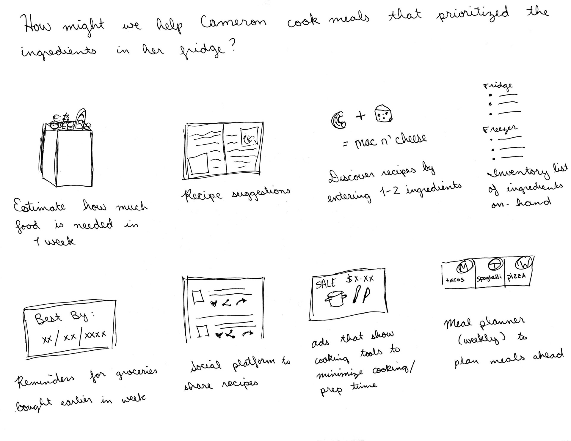
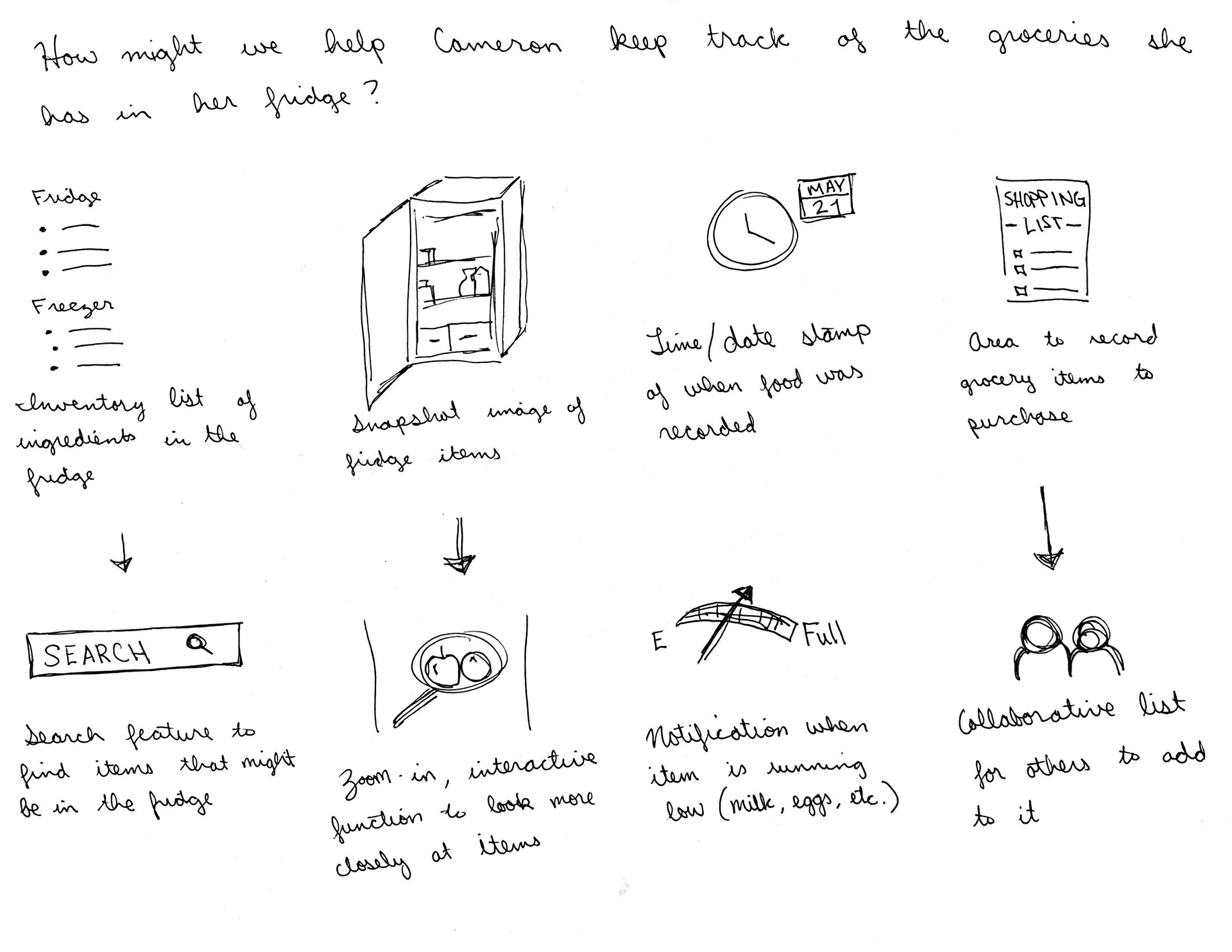
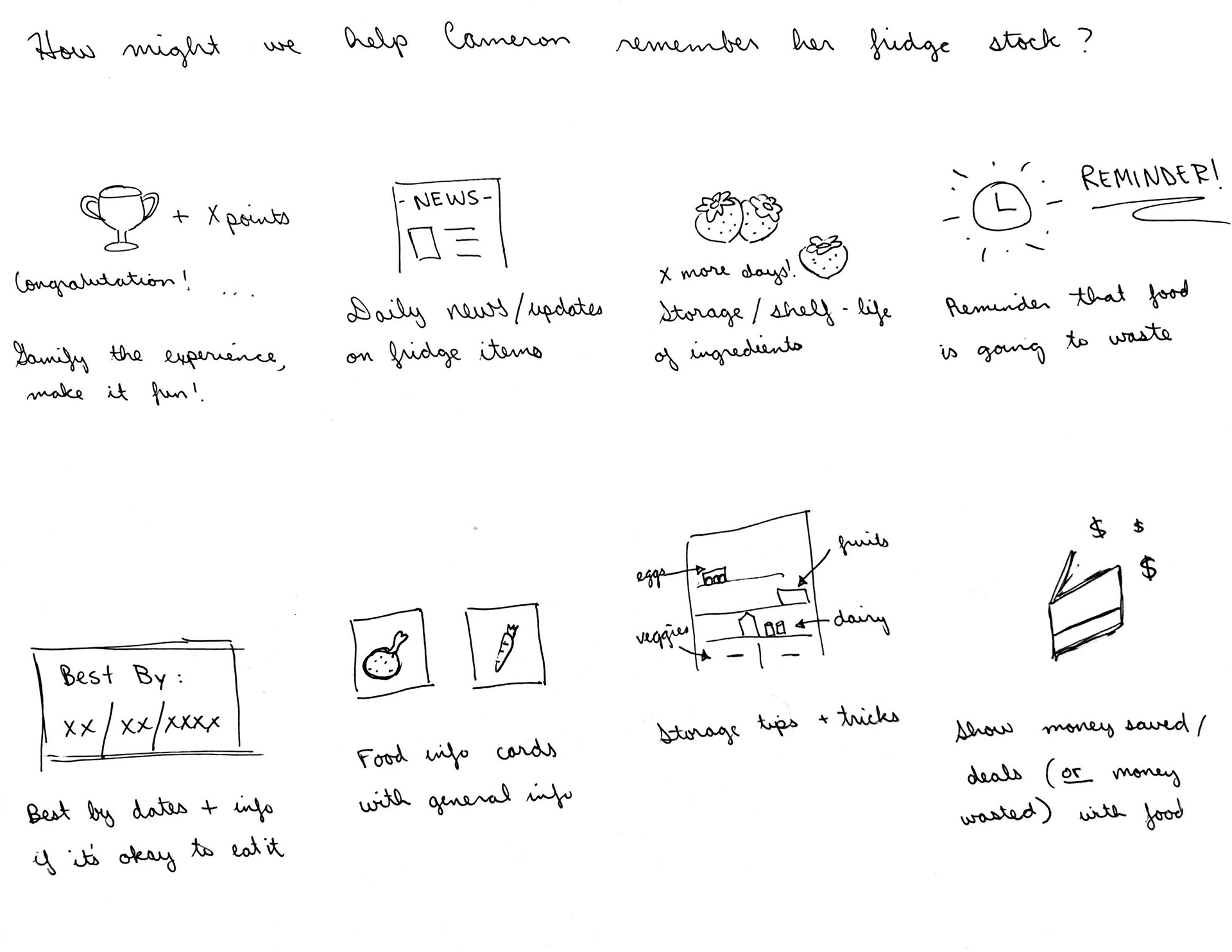
I used the Crazy 8s method to doodle ideas per each HMW question. I spent about 10 minutes each and tried to do really quick sketches to convey my ideas.
PRODUCT ROADMAP.
This product roadmap is to prioritize several key features aiming to solve Cameron's needs. I chose features to prioritize based on how relevant they were to solving the problem and keeping in mind what similar features other apps had to minimize the user learnability.
SITEMAP.
Then, I created a sitemap to visualize the information architecture of the app. This helped me determine where the best placement and user flow the app should provide for users.
USER FLOW.
To analyze the flow throughout the app, I mapped out a user flow scenario that was common among my research phase. This helped me learn which screens and UI elements were needed to implement the new features, while considering how to optimize user flows.
TASK FLOW.
I explored the flow in more detail by constructing a task flow about a user who was adding an item into their list. This showed me how the user would accomplish certain tasks based on the decisions the users makes throughout the app.
________
04. DESIGN
Goal: To design mid-fidelity wireframes for responsive screens
Process: Sketches / Branding / High-Fidelity Wireframes
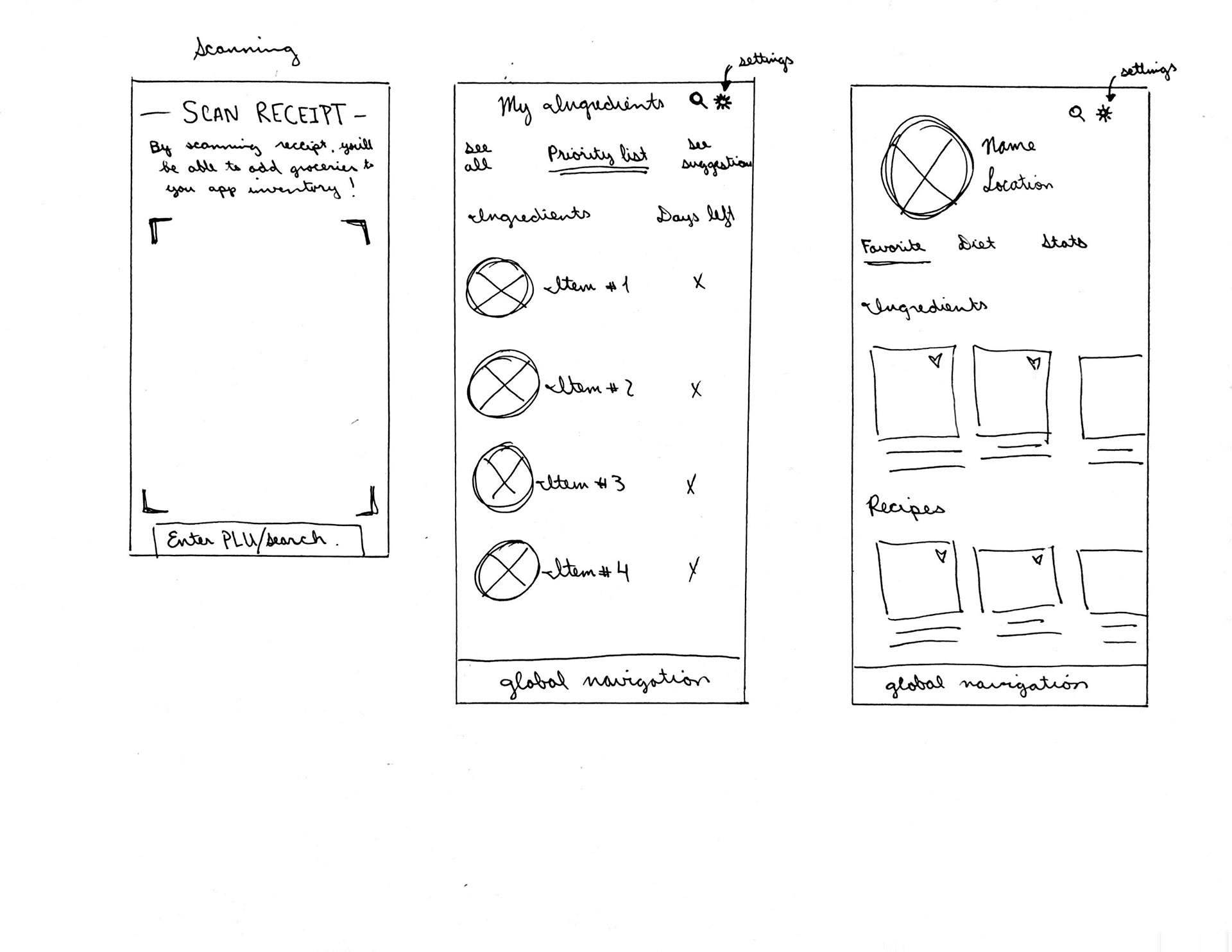
SKETCHES.
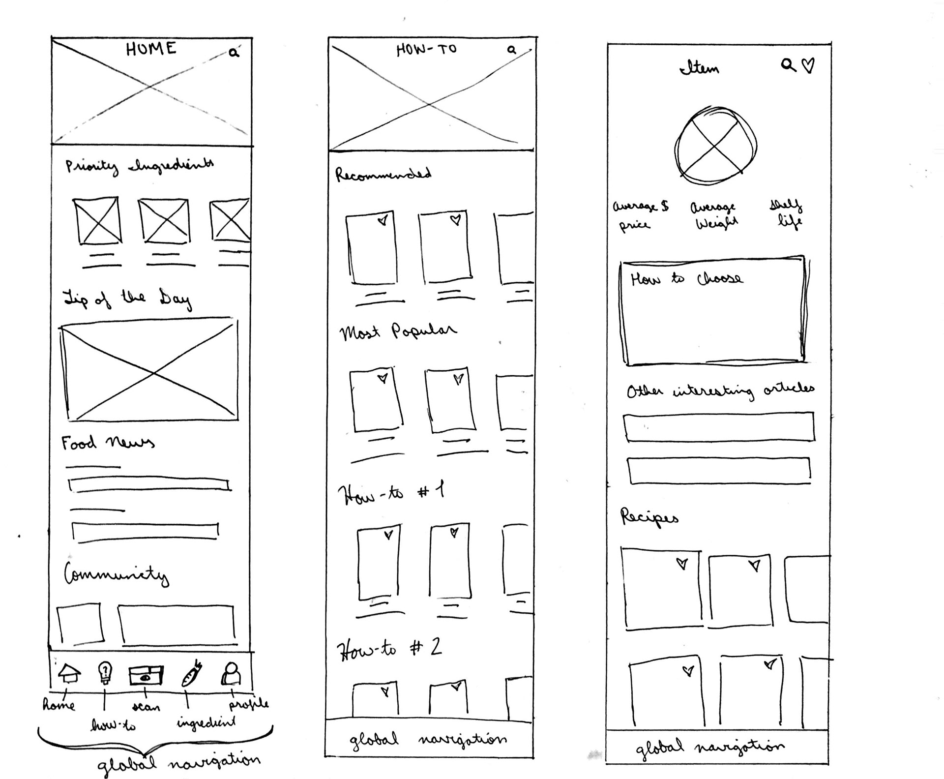
I began designing the UI of the new features by sketching out various screens that I intended to add.
BRANDING.
Before creating high-fidelity wireframes, I established the branding for Foodfull through the process of a mood board and creation of a logo that would represent the app as a fun and knowledgeable app.
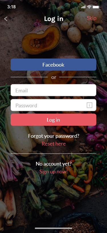
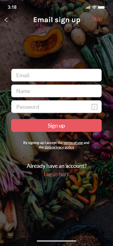
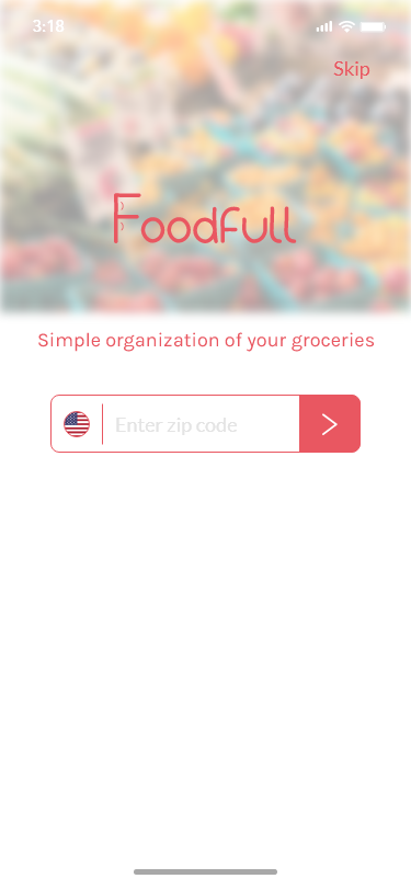
HIGH-FIDELITY WIREFRAMES.
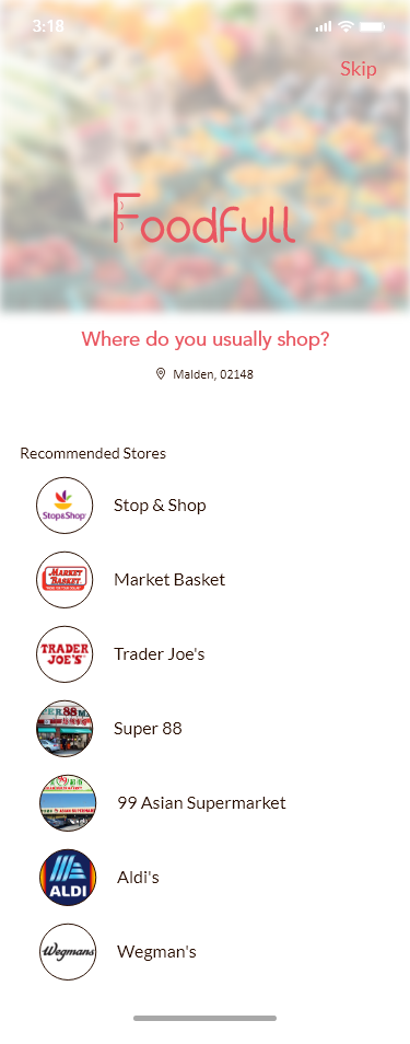
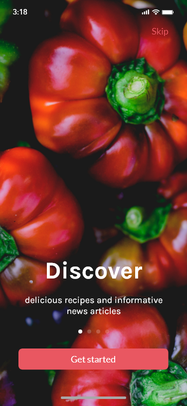
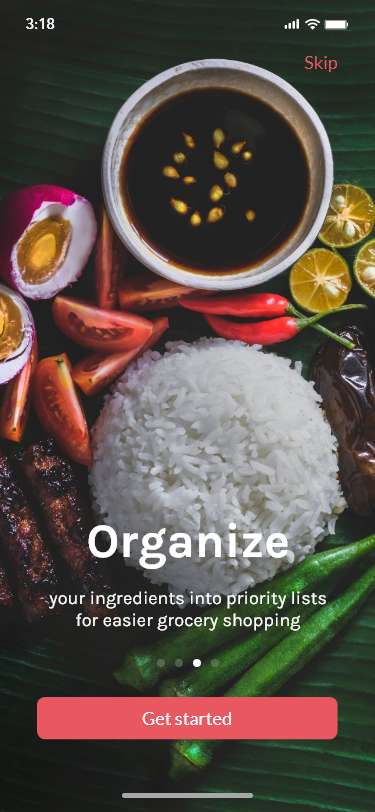
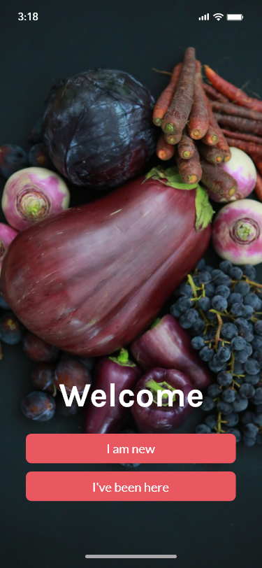
With the established branding, I updated my wireframes to be colorful and visually appealing.


________
05. PROTOTYPE
Goal: To prototype a mid-fidelity website and again usability feedback
Process: High-Fidelity Prototype / Usability Testing
HIGH-FIDELITY PROTOTYPE.
With the high-fidelity wireframes, I created a mobile prototype in Adobe XD to gather usability data from potential users. Feel free to interact with the prototype using the button below!
USABILITY TESTING.
Objectives:
• Test if users are able to accomplish tasks given successfully
• Identify areas of inconsistency within the design
• Determine the overall usability of the new features
• Test if users are able to accomplish tasks given successfully
• Identify areas of inconsistency within the design
• Determine the overall usability of the new features
Tasks, Errands:
Scenario 1
You're new to the app and you're getting set up. Walk-through the on-boarding steps.
• Task: Open the app and create an account with your email.
You're new to the app and you're getting set up. Walk-through the on-boarding steps.
• Task: Open the app and create an account with your email.
Scenario 2
You're looking to learn more about pineapples.
• Task: From the homepage, look for a how-to article on pineapples.
You're looking to learn more about pineapples.
• Task: From the homepage, look for a how-to article on pineapples.
Scenario 3
Input details about your newly bought strawberries.
• Task: Add strawberries into your ingredients.
Input details about your newly bought strawberries.
• Task: Add strawberries into your ingredients.
Results:
I conducted usability testing at local cafes with 4 participants who have a similar background to our persona, Cameron. From direct observation and audio recordings, I collected valuable usability feedback from target users.
I conducted usability testing at local cafes with 4 participants who have a similar background to our persona, Cameron. From direct observation and audio recordings, I collected valuable usability feedback from target users.
________
06. ITERATE
Goal: To iterate upon the design and develop high-fidelity wireframes
Process: Affinity Map / Revised Wireframes & Prototype / UI Kit
AFFINITY MAP.
I created an affinity map to synthesize the usability findings and to identify reoccurring behaviors and feedback. This allowed me to better understand the usability of the current design. The synthesized data indicated that minors adjustments would provide for more legibility in the overall design.
REVISED WIREFRAMES & PROTOTYPE.
With the information I gathered in the affinity map, I revised the wireframes and prototype. Feel free to interact with the revised prototype using the button below!
UI KIT.
While prototyping, I completed a UI kit to document UI elements and patterns for future reference.
REFLECTION.
This project is an optimistic solution for minimizing food waste because it is working with the assumption that users will be willing to try a new app on their phone besides using their method already in place. However, there is a lot of area for this product to grow because there are not as many apps that currently exist for users. With more tests and edits, this project has potential to gather more users and better its performance.
NEXT STEPS.
• Work with developers to identify any technical limitations
• Continue to design addition features and functionality for app that would cater to user needs
• Continue organizing design deliverable(s) for hand-off
• Work with developers to identify any technical limitations
• Continue to design addition features and functionality for app that would cater to user needs
• Continue organizing design deliverable(s) for hand-off
